When looking at wheel designs, it’s important to remember that the wheel has to match or at least synergise with the actual board design so they don’t clash and so they can be sold as a pair. So while it is important to look at designs and how they incorporate the shape of the wheel and the colours that they use, the actual designs themselves aren’t much use since I don’t have the board as a reference to see how they synergise. However not all wheels match the boards, mine will, therefor this research is useful for composition and colour theory, however the design will be completely dependant on the board. I can however look at how they incorporated their designs in order to work with a wheel rather than a board and it is interesting to see how they have arced and bended designs in order to fit into a circular design.
I have noticed though that a lot of these designs have been graphically drawn and coloured rather than hand sketched. I think this is an important note to make as I will need to figure out how I am going to actually create these designs.
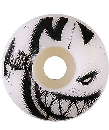
Bold text and design. Monochrome colours.
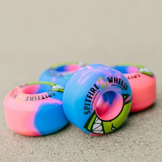
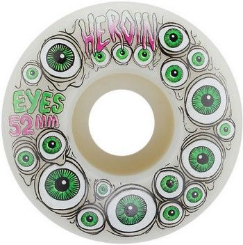
Psychedelic design and colours with bold text.
Very weird designs and very trip. Love the vibrant colours and typeface used.
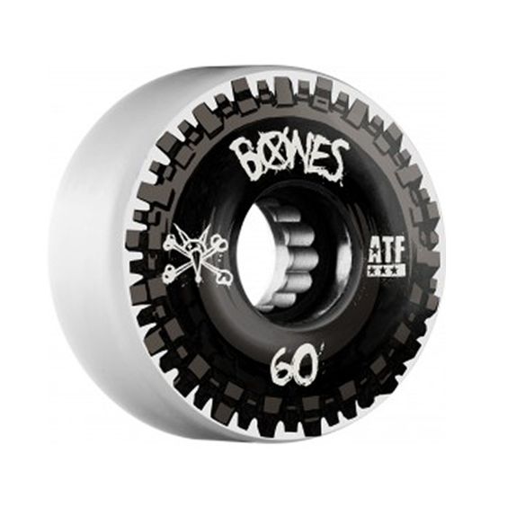
Very punk and gritty design.
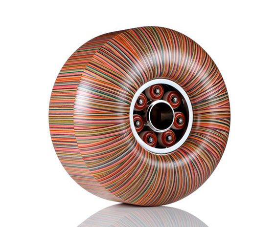
I love the Modern and indie design of this wheel and the straight lines used to make the image seem like one solid colour.
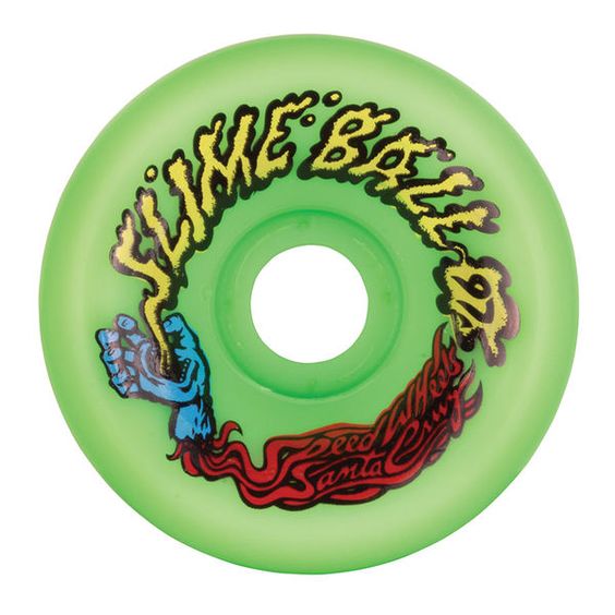
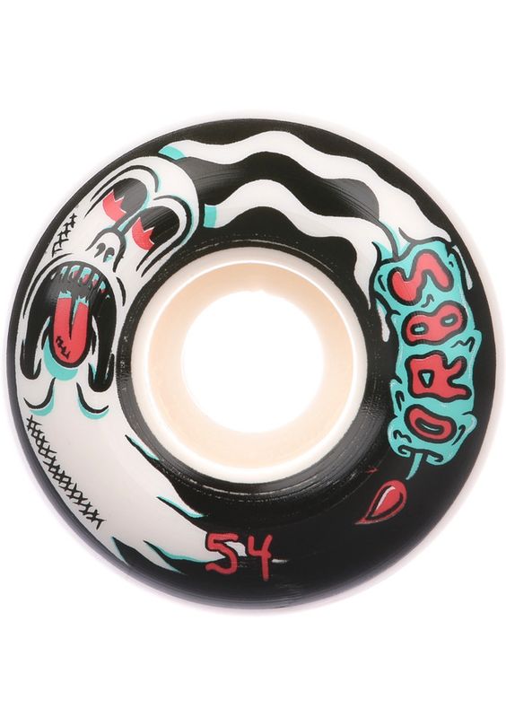
Personal favourite design. I love the ghost and illustrations used on this image.
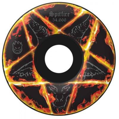
very hardcore/demonic design. Not sure about this one, I like the flames though, very striking.