When I finished my initial idea generation, I realised that the designs that I created where largely different from my initial research, this is because I didn’t really have a clear idea of what I wanted to create. Once I started creating ideas though, I began to gain a clear idea of what I wanted to create. For now I have 6 main ideas that I want to explore, 2 of which are based around Asian typography, specifically Japanese and Korean. However I am really drawn to this style because of my passion for typography but also because I think that creating designs like this would be great for targeting my intended audience. I will consider this further and look into peer feedback from peers and tutors to see if they like the idea of me doing 4 very similar designs for my boards. I also used a lot of similar designs when creating my shirt and hat designs as I think that it would be good to have similarities or have them directly connected in some way.
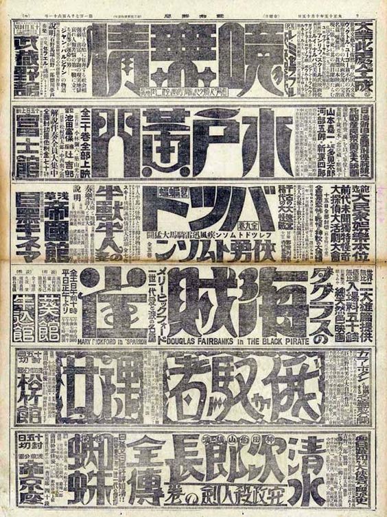
Below though, I started looking into different styles of Japanese lettering and how I could style my text for my board since at least one of the designs will be like this. I really like the bold and curvy text. I like how they only use curves where it’s necessary and trying to keep to the block, bold text as much as they can.
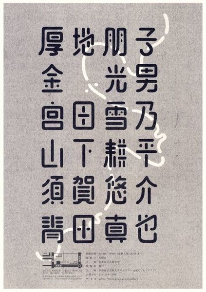
This next piece is looking at Japanese letters again but this time the shapes are curved at the ends and while they are still bold, they are easier to read and less intimidating to look at. I think that this is a great thing to consider for my board designs whether I want to go for a more friendly, curved style or a more bold and striking font.
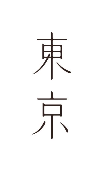
This font is kind of a mixture of the two, with thin, easy on the eyes shapes with a lot of curves but also a lot of sharp edges. I really like this font style and it would be interesting to see how it would work on a board or possible shirt design. When it comes to clothes designs for this though, I’m not sure that they would be popular or honestly look very good as they could be seen as a tourists shirt rather than something that’s fashionable or something that would connect well with the indie market.
I then looked at Chinese which is similar to Japanese however the words are lot more like blocks and a lot more compact making the words shorter but the shapes more complex. These fonts below convey a lot of different types of fonts that I could go with and different possible styles. I really like the ones that mix between sharp edges and curves rather than just one. I think that would be really interesting and fun to work with. I will have to experiment with different styles of typography before I make my decision.
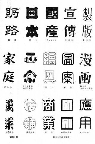
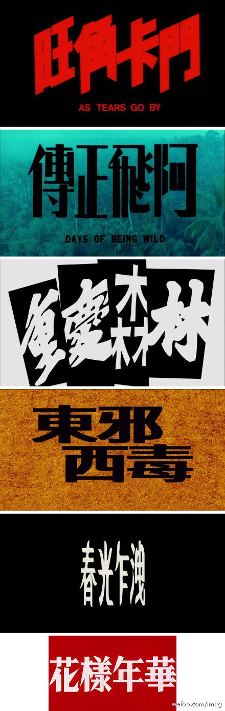
I again looked at Chinese lettering, they examples below are all very blocky and slanted in some cases to make them seem either more artistic or to look like something you would see in an action thriller. I don’t think this is the kind of style I want to go for however I think it is interesting to look at and consider.
To wrap up the dialects I looked at Korean, which unlike Japanese and Chinese, uses a lot of circles and ovals. This brings up many different possibilities for designs and compositions. I think that if I were to do multiple typography pieces then Korean would almost certainly be one of them.
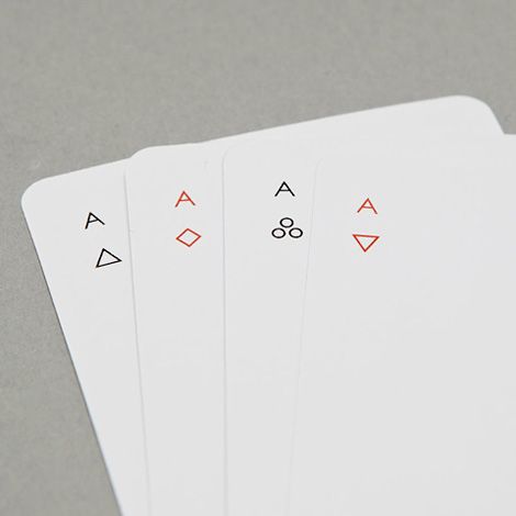
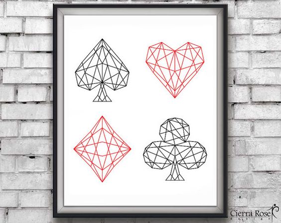
Moving on however, I started looking at card suits and how I could incorporate those designs into board, wheel and clothes designs. While I don’t think they would specifically work on a board I think they could be a really nice t-shirt design. The first example I looked at though was this which is a minimalistic rendition of card suits which I have never seen before and is something that is really interesting for me to look at. I think that while I shouldn’t do something exactly like this I may take inspiration from the style.
This is something pretty similar but using a wire mesh in order to put a spin on the classic suit of cards. I think that using full colour symbols that may either have a pattern or have something happen to them just to make it a little bit more unique rather than juts sticking something on a shirt and calling it finished.
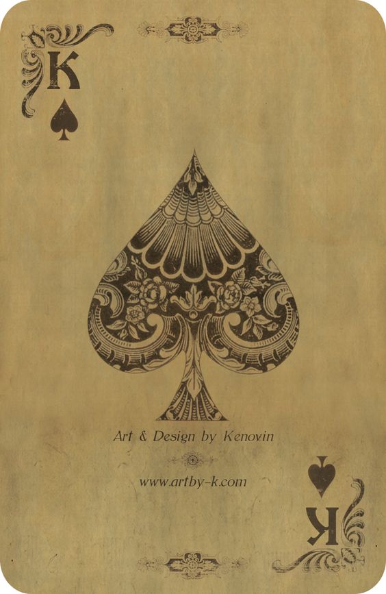
While this next design is my favourite, I think I would struggle with creating this with the amount of time that I have to work with on this project. However I think that using these symbols with cards and flowers are strangely synonymous with each other and make for a really vintage style which could be very popular amongst indie groups.
The next idea was using a city skyline for a board design, looking online I found this double exposure which I really like however I don’t think that I will expand much on this design, it might be good for a shirt design however, but I don’t want to use some random stock image for the model since I won’t have time to get my own pictures.

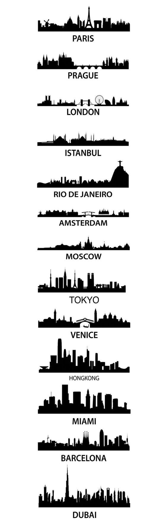
Here I found a selection of city silhouettes from around the world. While I really like this, once again I don’t think the idea is strong enough to use stock images for the design, this is a nice idea but I don’t think it’s going to work out.
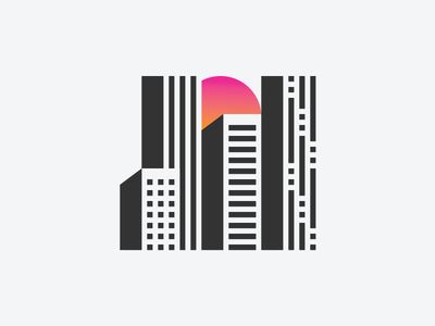
This though is a really neat minimalistic idea and may be something to consider for the shirt design however I would need to create my own original idea and come up with something completely different but in the same style.
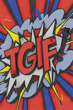
I then had an idea to use comic typography styles for my board however the more I think about doing it, the less I like it and I think that this is just a nice idea rather than something serious to be considered for a draft or final piece. I do really like this style though and I would really like to work with something like this in the future but I just don’t think it will work here.
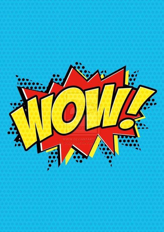
Same for this design as well which is nice to look at and interesting in design but I just think that it doesn’t have enough weight behind it to carry itself as a design.
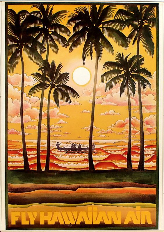
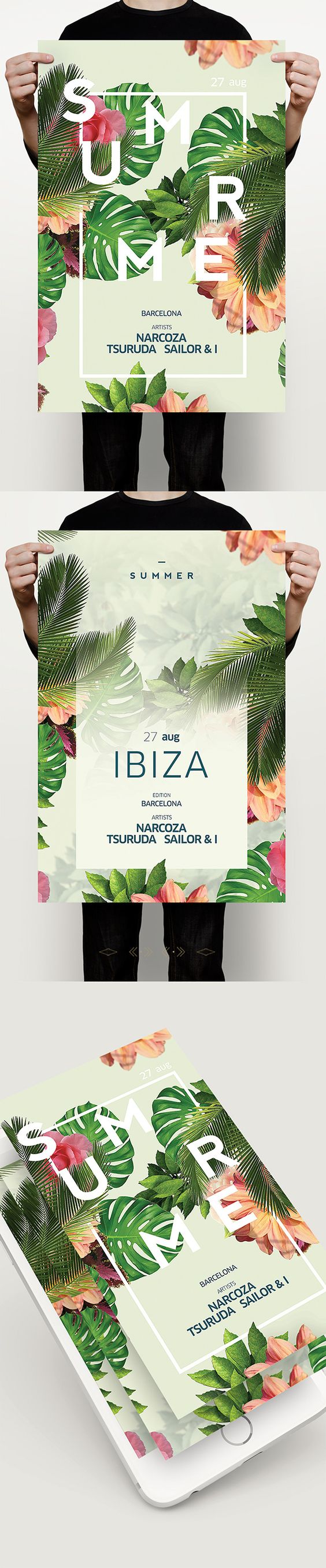
I then started to look at tropical designs for the shirt and hat design. The reason for this is that I found a lot of skater and indie clothes that either heavily feature or incorporate tropical/Hawaiian themes. I actually really like this kind of design however I think that this design would be much better suited for a t-shirt or hat design rather than a board/wheel design. I think this is because of modern fashion and especially the summer clothes designs that include this tropical theme.
A more indie twist to the tropical theme with the vibrant colours, symmetrical themes and the large logo in the centre.
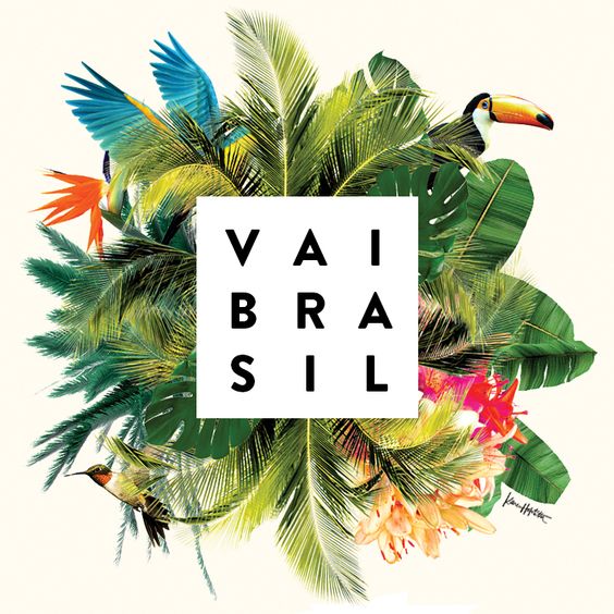
This is using the same tropical style in order to make it more indie and modern, this is the kind of style I want to go for when creating my drafts for the t-shirts.
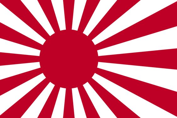
I’m still debating whether or not using this Japanese would be insensitive due to it’s history however I really like the design and think that it would look great on a board and on a piece of clothing. I may have to make my own due to how I want it placed however that shouldn’t be too hard. Regardless I really like this design and I may actually incorporate it into other designs.