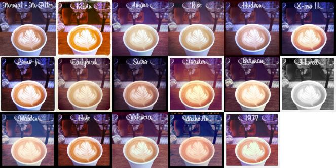
For Will’s lesson we were looking at filters on instagram and how we can use them/create them in photoshop. We explored levels, saturation, colour layers, black and white, vignettes and colour grading. Below is a chart of all the different available layers that you can use in instagram. As you can see, most of them focus on colour balancing for oranges and blues to make things seem more vintage or warmer. We used this mostly for reference material as we then took it upon ourselves to use photoshop in order to create these filters over a picture that we had taken previously to this.
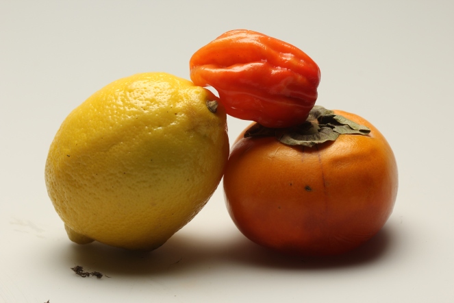
This was the initial image that I started with that we took in Adrian’s lesson. I used this image because of the wide range of colours used and the shadows in the image which are bold and noticeable. The first challenge was to find a style of filter we wanted to try to replicate, and while my attempt was to go for the 1977 filter it ended up more like Toaster due to the amount of yellow and orange used in the image along with the vignette used.
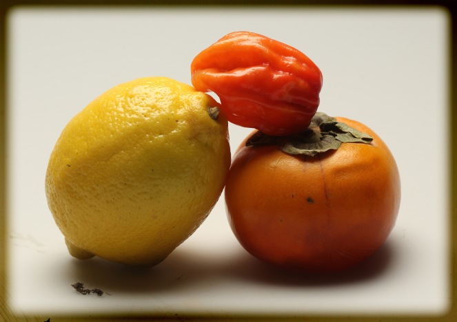
The first step was to create the vignette around the image. I went with this small vignette around the edge which made it look like a old photograph which was not intentional however I really like it like this so I kept with it and worked from that point. The vignette was created using the inner glow blending option and just changing the colour from a light yellow to black.
We then started looking at levels and colour grading. The first thing I did was boost the shading using the levels and contrast blending option. Once that was done I then coloured the shadows and started enhancing the colours using the colour blending tool in order to make the shadows lighter and more yellow.
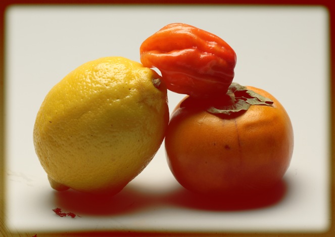
Once that was done I started to really focus on colour manipulation in order to eliminate most of the shadows on the fruit and enhance their colours, making them more vibrant. In doing this however it also effected the white background turning it a beige colour which actually works with the image as a whole as it makes it look warmer.
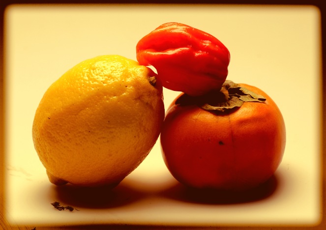
Once that was done we switched up the colour scale and attempted de-saturating the picture. This was very simple to do as we just used the black and white tool and de-saturated the image. However this is not the ending point as we then began messing with levels once again in order to make the image seem older and more worn.
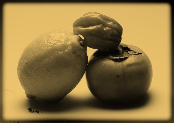
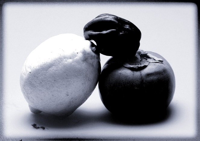
To create this image we has to really dig in with the levels and colour grading in order to make things that are dark become black (pepper and tomato) and the lighter things (lemon and background) become white. This was all we did in terms of colour grading and manipulation and all in all it was a very simple and beneficial lesson as it has taught be more about photoshop and how to fully manipulate images.
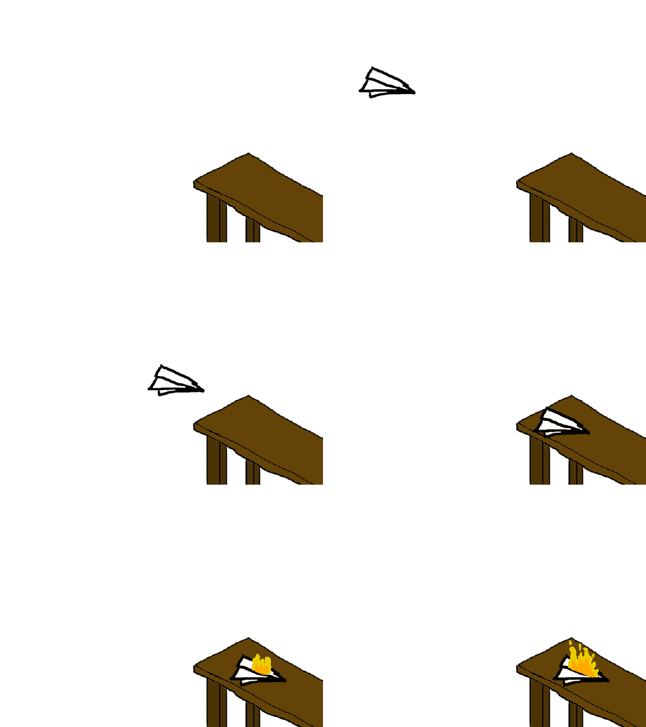
However that was not the end of the lesson as we then looked at animation in photoshop and the benefits and downsides to it. The benefit being that is very simple and easy to use, the downside being though is that it is not efficient to use and has many animation limitations since it is not a program made for animation. Despite this however I made this simple animation below of a paper plane landing on a table and then bursting into flames. It didn’t really take too long to do and was relatively simple to create by using the paintbrush and key framing in order to create this. This lesson though was very important to me as for my music video I am wanting to use animation and now that I know how to make animations in photoshop this makes my life so much easier as I am now able to work on my animation at home as well as at college.
- Covered in Will’s lesson
- Layer masking
- Smart objects
- Digital Painting
- Adjustment layers
- professional practice (DPI)
- DPI – dots per inch
- Print work – 150 DPI
- Labeling layers
- Name files properly
- All computer screens run on RGB that has more possible colours than printed work (! on colour means it cannot be printed)
- CMYK for commercial printing